Mangled and Spangled
-
Steinie

- Captain
- Posts: 2958
- Joined: 21 May 2009, 17:38
- Type the number ten into the box: 10
Mangled and Spangled
I'll try to get this done by tomorrow night.
- Attachments
-

-
Steinie
- Captain
- Posts: 2958
- Joined: 21 May 2009, 17:38
- Type the number ten into the box: 10
Re: Mangled and Spangled
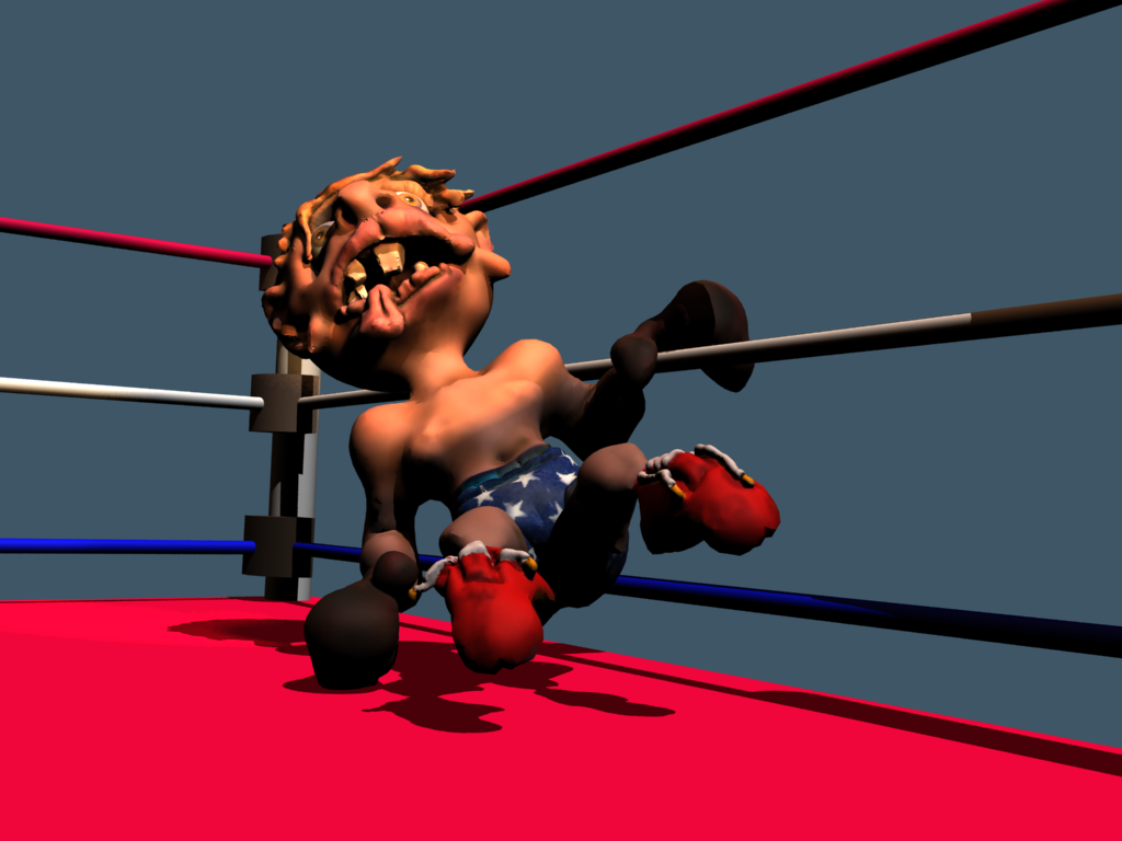
Sculptris was used to model and texture the Boxer. I used the Modeler side of trueSpace to create the stars overhead.
I combined the scene in workSpace and added the lighting. I wanted to really enhance the colors especially the blues for
that patriotic feel so Photoshop was used.
The stars were modeled in trueSpace, rendered separately and then combined with the Boxer render in Photoshop.
I combined the scene in workSpace and added the lighting. I wanted to really enhance the colors especially the blues for
that patriotic feel so Photoshop was used.
The stars were modeled in trueSpace, rendered separately and then combined with the Boxer render in Photoshop.
- Attachments
-

- StarsOverhead.png (7.72 KiB) Viewed 3352 times
-
-
Steinie
- Captain
- Posts: 2958
- Joined: 21 May 2009, 17:38
- Type the number ten into the box: 10
Re: Mangled and Spangled
The finale render after choosing "just the right camera view"
I wanted the viewer to feel like they were the other boxer and tried to
show that view point.
I wanted the viewer to feel like they were the other boxer and tried to
show that view point.
- Attachments
-

-
Steinie
- Captain
- Posts: 2958
- Joined: 21 May 2009, 17:38
- Type the number ten into the box: 10
Re: Mangled and Spangled
Well you ever wake up in the morning and see things differently? (A bar sounds familiar...)
I just looked at my submission and couldn't stop thinking "MAD Magazine" It just wasn't the
"Steinie" look. I also wanted to play with the lighting and mood in the scene. I like the "look" of
this work better.
I just looked at my submission and couldn't stop thinking "MAD Magazine" It just wasn't the
"Steinie" look. I also wanted to play with the lighting and mood in the scene. I like the "look" of
this work better.
- Attachments
-

-
pugman 1
- Captain
- Posts: 1555
- Joined: 21 May 2009, 19:26
- Type the number ten into the box: 0
- Location: Germany
Re: Mangled and Spangled
Looking mighty fine there steinie . 
-
Finis

- Captain
- Posts: 5410
- Joined: 21 May 2009, 18:26
- Type the number ten into the box: 0
- Location: America!
Re: Mangled and Spangled
I liked the first one better. It has that Mad Magazine look but the latest hides a lot of your work on his face which is the main thing to show mangling, Also, he is floating. If he is supposed to be falling from a punch, well, the pose says on the floor and ropes. The latest one does show how his legs are posed better. It looked odd in the earlier one where "what's happening with his legs?" distracted from the rest. He is looking right into the camera in the first one which I think is not good.
Otherwise, good. Imaginative way to get a flag theme in there. The latest does position the stars better vs. the ropes (stripes) for that.
Otherwise, good. Imaginative way to get a flag theme in there. The latest does position the stars better vs. the ropes (stripes) for that.
I prefer dangerous freedom over peaceful servitude. -- Thomas Jefferson/Jean Jacques Rousseau